> ## Documentation Index
> Fetch the complete documentation index at: https://help-empuls.xoxoday.com/llms.txt
> Use this file to discover all available pages before exploring further.
# Survey analytics
> Use the Empuls survey analytics dashboard to read eNPS scores, engagement driver trends, heatmaps, sentiment data, and build action plans from results.
The Empuls survey analytics dashboard gives you a comprehensive, real-time view of employee feedback — from headline eNPS scores and engagement driver breakdowns to sentiment analysis on open-ended responses. This guide shows you how to navigate the dashboard, interpret what you see, and turn insights into action.
You need a **Super Admin**, **Admin**, or **Survey Admin** role to access survey analytics. Results become visible as soon as sufficient responses are collected.
## Navigating to the analytics dashboard
Go to **Surveys > Pulse & eNPS Surveys** from the left-hand navigation menu.
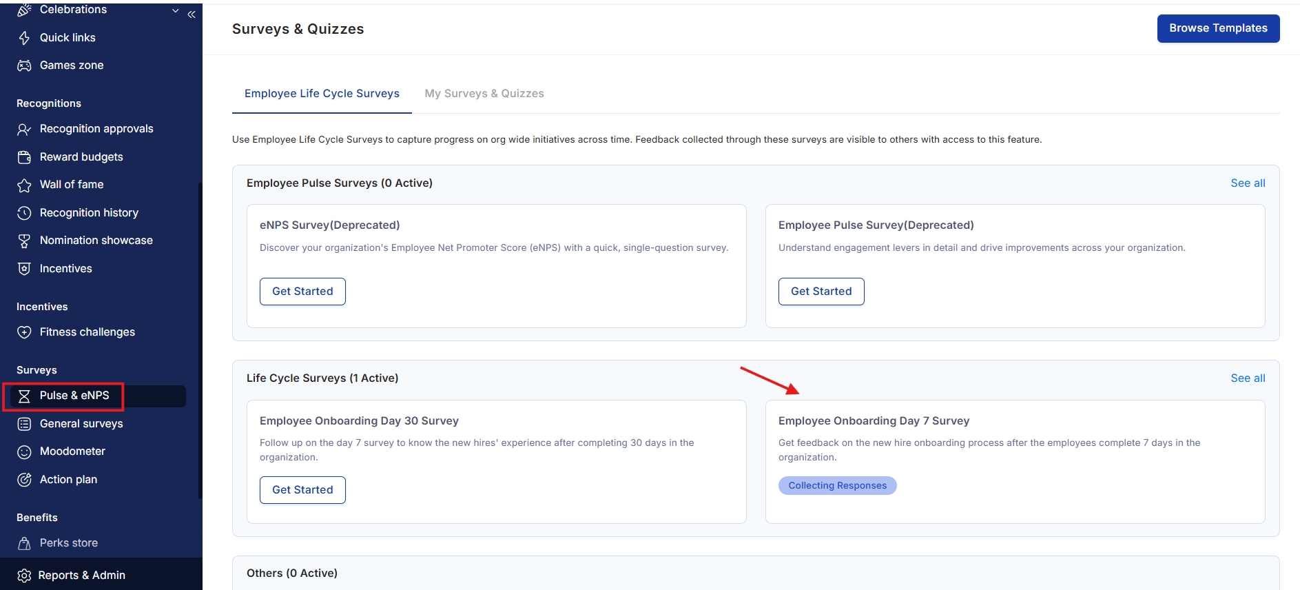 Choose any survey that is **completed** or **currently running**. Click on the survey name to open its analytics dashboard.
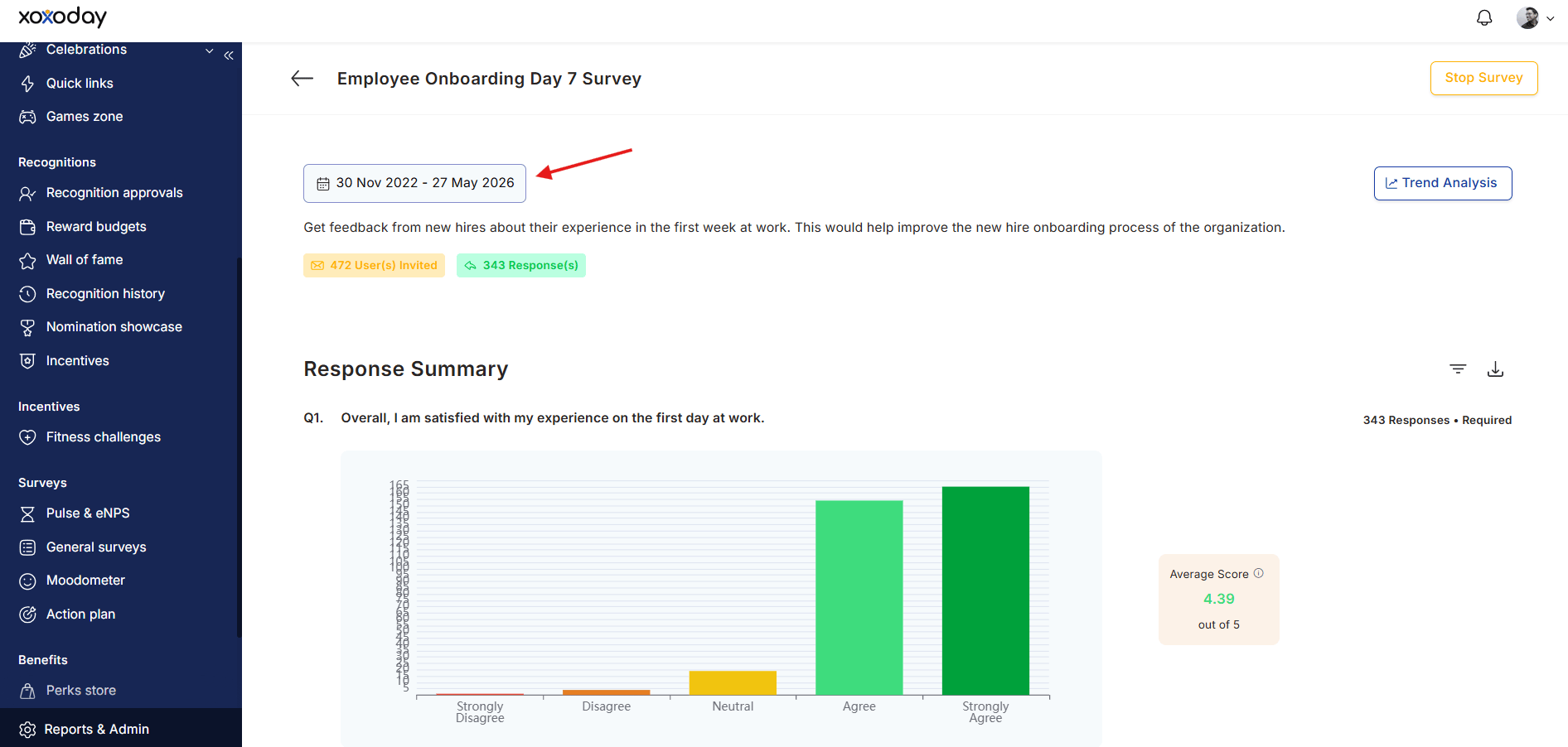
Use the **date dropdown** at the top of the dashboard to select the time period you want to analyze.
Choose any survey that is **completed** or **currently running**. Click on the survey name to open its analytics dashboard.
Use the **date dropdown** at the top of the dashboard to select the time period you want to analyze.
 ## Dashboard sections
### Summary — engagement driver scores
The **Summary** tab displays the average score for each of the four engagement drivers:
* **Recognition and career growth**
* **Relationships and culture**
* **Hygiene factors**
* **Strategic connect**
Each driver score gives you a quick read on where employee sentiment is strongest and where it needs attention. Click **View Trends** to see how driver scores have changed across survey runs over time.
### eNPS scores
The **eNPS** tab shows the distribution of responses across **Detractors**, **Passives**, and **Promoters** for each eNPS question. Color coding indicates performance level:
| Score range | Rating |
| ----------- | ----------- |
| Below 0 | Below par |
| 0 to +30 | Par |
| +30 to +50 | Excellent |
| +50 to +70 | World-class |
| Above +70 | Exceptional |
The tab also shows your score against a cross-industry benchmark line, helping you contextualize your result.
### Engagement drivers detail
The **Engagement Drivers** tab breaks each of the four drivers into their constituent **dimensions** — the specific Likert scale questions that feed into each driver. Click the **expand icon** next to any driver to see its dimensions. Click **View** next to a dimension to see the specific questions and their responses.
Each dimension is categorized as one of: **Weakness**, **At-risk**, **Acceptable**, **Improving**, or **Strength** — based on the score and its trend over the last three survey runs. See [eNPS and pulse surveys](/admin/surveys/enps-pulse) for a full explanation of each category.
### Feedback comparison (heatmap)
The **Feedback Comparison** tab displays a color-coded heatmap that lets you compare scores across different employee groups side by side. Higher scores appear in warmer colors; lower scores in cooler colors.
Use the dropdown to choose the comparison level:
* **NPS & engagement drivers** — high-level comparison
* **NPS, drivers, and dimensions** — mid-level comparison
* **All NPS & Likert questions** — full question-by-question comparison
To compare a specific team or location against a relevant sub-group rather than the whole organization, use **Internal Benchmarking**. The "Org" comparison dropdown filters to only show regions or categories where the selected view has employees — so your site in Asia is compared to Asia-region scores, not global averages.
Groups with fewer than 5 responses display as **"NA"** to protect respondent confidentiality. Groups not mapped to a user group also display as "NA".
### Likert scale questions
The **Likert Scale Questions** tab displays every Likert question with its average score and a color-coded response distribution bar. Hover over any bar to see a detailed breakdown of how employees responded across each scale point.
Sort questions using the dropdown:
* **Best to worst** — start with your highest-scoring questions
* **Worst to best** — start with your areas of greatest concern
* **Default sort** — the original question order
Use the **All Engagement Drivers** dropdown to filter and view questions grouped by driver.
### Open-ended feedback and AI summary
The **Open Ended Questions** tab shows all free-text responses to open-ended questions.
**Searching responses**: Type a keyword in the search box to filter responses and locate specific themes quickly.
**AI summary**: For each open-ended question, Empuls generates an AI-powered summary using Natural Language Processing (NLP). The summary includes:
* **Sentiment analysis** — responses are categorized as Positive, Neutral, or Negative. This gives you an instant read on the overall emotional tone without reading every individual response.
* **Insights breakdown by demographics** — filter the AI summary by Department, Designation, or Business Unit to pinpoint whether sentiment differs across groups (for example, whether engineers feel differently about work-life balance than sales teams).
* **Group analysis** — the AI highlights anomalies and contrasts between cohorts. For example, it might flag that one business unit has a 40% lower sentiment score on a specific topic compared to the organizational average.
Use the AI summary to quickly identify "hotspots" — groups or topics that need immediate attention — and "bright spots" — areas where things are working well enough to replicate elsewhere.
## Filtering and custom views
### Filtering data
Click the **filter icon** to narrow down the dashboard data by:
* Business Unit
* Location
* Cost Center
* Designation
* Department
* Tenure
* Grade
Select your criteria and click **Apply Filter** to update the entire dashboard view.
### Custom views
The custom views dropdown lets you switch between pre-configured views based on access permissions:
* **Everyone** — organization-wide data
* **My Team** — data for your direct reports
* **HRBP View** — data for the business units or regions your HRBP role covers
* **Custom Access View** — any view created and assigned to you
### Managing views
Click **Manage Views** to see all default and custom views. To create a new view:
1. Click **+ Create New View** at the bottom of the panel.
2. Give the view a **name**.
3. Apply the **filters** that define the audience for this view.
4. Click **Create** to save.
## Engagement trends
The **trends chart** plots eNPS values (on the Y-axis) across the last six survey runs, alongside a confidence range and the industry benchmark line (shown in green). This helps you answer questions like:
* Is engagement improving, declining, or holding steady?
* Are we above or below the industry benchmark?
* Did a specific organizational change correlate with a shift in scores?
The **Engagement Drivers Trends** chart plots all four driver trendlines on the same X-axis, enabling you to see which drivers are correlated with changes in eNPS over time.
## Downloading survey reports
Click the **download icon** at the top of the dashboard to export the full survey report. The downloaded report includes all scores, distributions, and open-ended responses.
## Adoption summary
Click **Adoption Summary** to view the response rate across user groups. The graph uses color coding to show:
* **Completed** — employees who finished the survey
* **Partial response** — employees who started but didn't finish
* **No response** — employees who did not open the survey
Use adoption data to identify groups with low response rates and follow up with targeted reminders.
## Sharing results with stakeholders
To share survey highlights with leadership or HR business partners:
* Download the full PDF or CSV report using the **download icon**
* Share a filtered custom view by creating a view scoped to the relevant department or business unit, then sharing the link
* Export individual sections (such as the engagement driver breakdown) directly from the relevant tab
## FAQs
Results appear in real time as responses come in. A minimum of 5 responses is required for a data point to display — groups with fewer responses show as "NA".
Yes. Use the filter icon at the top of the dashboard and select the criteria you want. The entire dashboard updates to reflect the filtered view.
Review results after every completed survey run, and track trends quarterly to identify meaningful patterns. For recurring surveys, check the adoption summary mid-run to send reminders to non-respondents.
Yes. Use the date selector to navigate between runs, and the trends charts to overlay multiple runs on a single timeline.
Access is controlled by role. Super Admins and Survey Admins see organization-wide data. HRBP views are scoped to specific business units. Custom views can be configured for specific managers or stakeholders.
## Related
Understand how scores are calculated and what engagement drivers mean.
Full guide to building and sending surveys.
Configure milestone-triggered surveys for onboarding, exit, and more.
## Dashboard sections
### Summary — engagement driver scores
The **Summary** tab displays the average score for each of the four engagement drivers:
* **Recognition and career growth**
* **Relationships and culture**
* **Hygiene factors**
* **Strategic connect**
Each driver score gives you a quick read on where employee sentiment is strongest and where it needs attention. Click **View Trends** to see how driver scores have changed across survey runs over time.
### eNPS scores
The **eNPS** tab shows the distribution of responses across **Detractors**, **Passives**, and **Promoters** for each eNPS question. Color coding indicates performance level:
| Score range | Rating |
| ----------- | ----------- |
| Below 0 | Below par |
| 0 to +30 | Par |
| +30 to +50 | Excellent |
| +50 to +70 | World-class |
| Above +70 | Exceptional |
The tab also shows your score against a cross-industry benchmark line, helping you contextualize your result.
### Engagement drivers detail
The **Engagement Drivers** tab breaks each of the four drivers into their constituent **dimensions** — the specific Likert scale questions that feed into each driver. Click the **expand icon** next to any driver to see its dimensions. Click **View** next to a dimension to see the specific questions and their responses.
Each dimension is categorized as one of: **Weakness**, **At-risk**, **Acceptable**, **Improving**, or **Strength** — based on the score and its trend over the last three survey runs. See [eNPS and pulse surveys](/admin/surveys/enps-pulse) for a full explanation of each category.
### Feedback comparison (heatmap)
The **Feedback Comparison** tab displays a color-coded heatmap that lets you compare scores across different employee groups side by side. Higher scores appear in warmer colors; lower scores in cooler colors.
Use the dropdown to choose the comparison level:
* **NPS & engagement drivers** — high-level comparison
* **NPS, drivers, and dimensions** — mid-level comparison
* **All NPS & Likert questions** — full question-by-question comparison
To compare a specific team or location against a relevant sub-group rather than the whole organization, use **Internal Benchmarking**. The "Org" comparison dropdown filters to only show regions or categories where the selected view has employees — so your site in Asia is compared to Asia-region scores, not global averages.
Groups with fewer than 5 responses display as **"NA"** to protect respondent confidentiality. Groups not mapped to a user group also display as "NA".
### Likert scale questions
The **Likert Scale Questions** tab displays every Likert question with its average score and a color-coded response distribution bar. Hover over any bar to see a detailed breakdown of how employees responded across each scale point.
Sort questions using the dropdown:
* **Best to worst** — start with your highest-scoring questions
* **Worst to best** — start with your areas of greatest concern
* **Default sort** — the original question order
Use the **All Engagement Drivers** dropdown to filter and view questions grouped by driver.
### Open-ended feedback and AI summary
The **Open Ended Questions** tab shows all free-text responses to open-ended questions.
**Searching responses**: Type a keyword in the search box to filter responses and locate specific themes quickly.
**AI summary**: For each open-ended question, Empuls generates an AI-powered summary using Natural Language Processing (NLP). The summary includes:
* **Sentiment analysis** — responses are categorized as Positive, Neutral, or Negative. This gives you an instant read on the overall emotional tone without reading every individual response.
* **Insights breakdown by demographics** — filter the AI summary by Department, Designation, or Business Unit to pinpoint whether sentiment differs across groups (for example, whether engineers feel differently about work-life balance than sales teams).
* **Group analysis** — the AI highlights anomalies and contrasts between cohorts. For example, it might flag that one business unit has a 40% lower sentiment score on a specific topic compared to the organizational average.
Use the AI summary to quickly identify "hotspots" — groups or topics that need immediate attention — and "bright spots" — areas where things are working well enough to replicate elsewhere.
## Filtering and custom views
### Filtering data
Click the **filter icon** to narrow down the dashboard data by:
* Business Unit
* Location
* Cost Center
* Designation
* Department
* Tenure
* Grade
Select your criteria and click **Apply Filter** to update the entire dashboard view.
### Custom views
The custom views dropdown lets you switch between pre-configured views based on access permissions:
* **Everyone** — organization-wide data
* **My Team** — data for your direct reports
* **HRBP View** — data for the business units or regions your HRBP role covers
* **Custom Access View** — any view created and assigned to you
### Managing views
Click **Manage Views** to see all default and custom views. To create a new view:
1. Click **+ Create New View** at the bottom of the panel.
2. Give the view a **name**.
3. Apply the **filters** that define the audience for this view.
4. Click **Create** to save.
## Engagement trends
The **trends chart** plots eNPS values (on the Y-axis) across the last six survey runs, alongside a confidence range and the industry benchmark line (shown in green). This helps you answer questions like:
* Is engagement improving, declining, or holding steady?
* Are we above or below the industry benchmark?
* Did a specific organizational change correlate with a shift in scores?
The **Engagement Drivers Trends** chart plots all four driver trendlines on the same X-axis, enabling you to see which drivers are correlated with changes in eNPS over time.
## Downloading survey reports
Click the **download icon** at the top of the dashboard to export the full survey report. The downloaded report includes all scores, distributions, and open-ended responses.
## Adoption summary
Click **Adoption Summary** to view the response rate across user groups. The graph uses color coding to show:
* **Completed** — employees who finished the survey
* **Partial response** — employees who started but didn't finish
* **No response** — employees who did not open the survey
Use adoption data to identify groups with low response rates and follow up with targeted reminders.
## Sharing results with stakeholders
To share survey highlights with leadership or HR business partners:
* Download the full PDF or CSV report using the **download icon**
* Share a filtered custom view by creating a view scoped to the relevant department or business unit, then sharing the link
* Export individual sections (such as the engagement driver breakdown) directly from the relevant tab
## FAQs
Results appear in real time as responses come in. A minimum of 5 responses is required for a data point to display — groups with fewer responses show as "NA".
Yes. Use the filter icon at the top of the dashboard and select the criteria you want. The entire dashboard updates to reflect the filtered view.
Review results after every completed survey run, and track trends quarterly to identify meaningful patterns. For recurring surveys, check the adoption summary mid-run to send reminders to non-respondents.
Yes. Use the date selector to navigate between runs, and the trends charts to overlay multiple runs on a single timeline.
Access is controlled by role. Super Admins and Survey Admins see organization-wide data. HRBP views are scoped to specific business units. Custom views can be configured for specific managers or stakeholders.
## Related
Understand how scores are calculated and what engagement drivers mean.
Full guide to building and sending surveys.
Configure milestone-triggered surveys for onboarding, exit, and more.